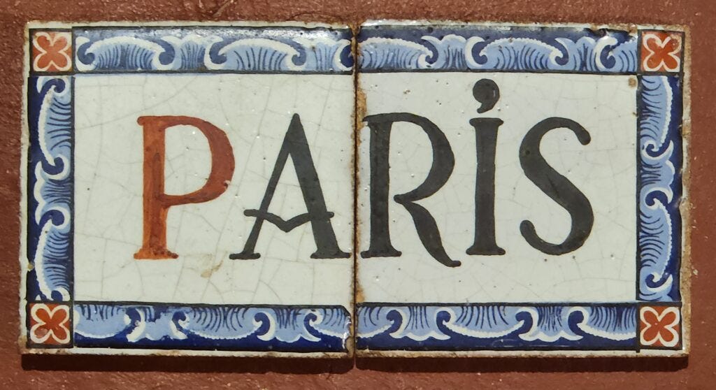
My father was strolling by a Paris metro entrance during an upgrade of the system many years ago. He looked down and spied amidst a pile of debris, two tiles.
”PA” and “RIS” — and they used to be part of the station wall, identifying the name of the station.
If you know more about these tiles, please contact me and share what you know. If you are from a museum, I’d be very interested in getting them to your collection.
Information added 2/27/2026 using Gemini AI:
These are Nord-Sud Company tiles, specifically from the “Station-Type” frieze designed by Lucien Bechmann in 1910.
The “Nord-Sud” Signature: While the city-run CMP used simple white tiles, the private Nord-Sud line (now Lines 12 and 13) wanted to be the “Luxury” line. They used a specific visual language that my father rescued:
The Wave (The “Vague”): That blue and white wave pattern was the official border for all Nord-Sud stations. It’s actually a stylized “S” or “N” motif representing the “North-South” connection.
The Red “X”: These were decorative rosettes. In the 1910 design, the color of the frieze and the rosettes told the passengers what kind of station they were in.
Brown/Yellow: Standard stations.
Green: Transfer stations.
Blue/Red: Major hubs and terminal stations (like Gare de Paris-Saint-Lazare).
The Lettering: Even if they look black, they were often a very deep, midnight cobalt that darkened over decades of tunnel grime.
The “Grand Finale” Station: Since they spell “PARIS” and have the “Major Hub” blue/red frieze, your father likely found them at the entrance to Paris-Saint-Lazare. During the 1960s/70s, that station was “modernized” with aggressive orange and plastic panels, and the beautiful 1910 ceramic murals were literally hammered off the walls.